
Can we predict economic well-being from space? That’s the question I tackled in this project, AI-Driven Poverty Mapping. Using deep learning and satellite imagery, I built a model to predict economic activity scores across Morocco, aiming to identify poverty hotspots and understand wealth distribution patterns without relying solely on expensive, infrequent census data.
⚠️ Proof of Concept: This project is a research experiment (POC) and should be interpreted as such. The results, while promising, contain biases (discussed below) and are not a substitute for official economic data.
The Mission
Traditional methods of measuring poverty are often slow, costly, and granular only to a certain level. Satellite imagery offers a high-frequency, scalable alternative. By training a model to correlate visual features (infrastructure, night lights, density) with economic scores, we can generate granular “poverty maps” that help NGOs and governments target aid more effectively.
In this experiment, I analyzed 3,481 locations across Morocco to classify them into economic tiers.
Data Collection
The foundation of this project is high-quality satellite imagery. I used Google Earth Engine (GEE) to create the dataset.

Using a custom manual script in GEE, I sampled thousands of geolocation points across Morocco. For each point, I extracted a satellite image patch. This allowed me to build a diverse dataset covering urban centers, rural villages, and unsettled terrain.
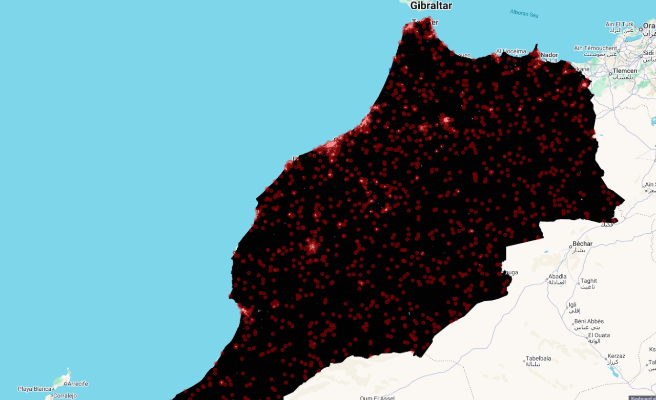
The map above shows the distribution of the sampled points used for training and testing.
Model Architecture
To process these images, I chose the EfficientNet-B0 architecture.
Why EfficientNet-B0?
For this POC, EfficientNet-B0 was the ideal choice over heavier models like ResNet-50.
- Efficiency vs. Accuracy: It achieves comparable or better accuracy with significantly fewer parameters (approx. 5.3M vs 25M+ for ResNet50).
- Feature Extraction: Its “compound scaling” method allows it to capture complex spatial patterns like density, road networks, and infrastructure quality without requiring massive computational resources.
The architecture pipeline is simple but effective:
- Input: 224x224 RGB satellite patches.
- Backbone: EfficientNet-B0 (Pre-trained on ImageNet) to extract high-level features.
- Head: A custom fully connected layer reducing to a single output neuron.
- Activation: Sigmoid function to bound the predicted “Wealth Score” between 0 and 1.
Methodology
The task was formulated as a regression problem, where the model predicts a continuous “Wealth Score” ranging from 0.0 (High Poverty) to 1.0 (Wealthy).
The Dataset Breakdown
Based on the available ground truth and model predictions, the distribution of economic zones in our dataset was stark:
- High Poverty (0 - 0.2): 3,288 locations (94.5%)
- Developing (0.2 - 0.5): 184 locations (5.3%)
- Middle Class (0.5 - 0.8): 9 locations (0.3%)
- Wealthy (0.8 - 1.0): 0 locations (0.0% in this specific sample subset)
This heavy skew towards the lower end of the spectrum highlights both the reality of the regions sampled and the potential class imbalance challenges for the model.
Model Training
The training process was rigorous. Over 15 epochs, the model showed remarkable convergence.
- Starting MAE: 0.31 (Average error of 31% on the score).
- Final MAE: 0.03 (Average error of just 3%!).
Metrics Explained
To evaluate the model, I used Mean Squared Error (MSE) for the loss function (to punish large errors) and Mean Absolute Error (MAE) for interpretability.
Mean Squared Error (MSE):
MSE = (1/n) * Σ (y_true - y_pred)^2
Mean Absolute Error (MAE):
MAE = (1/n) * Σ |y_true - y_pred|
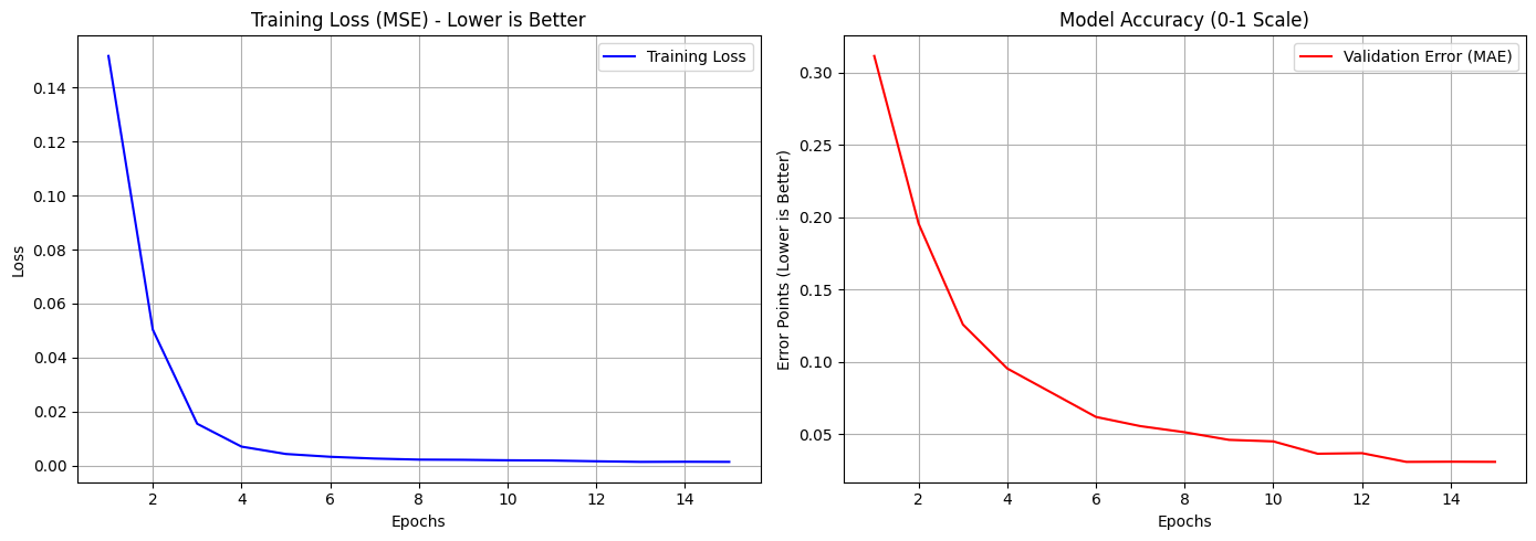 The validation Mean Absolute Error (MAE) dropped rapidly, stabilizing at 0.03 by epoch 13.
Prediction quality
We can see the correlation between the Actual (Ground Truth) and Predicted scores below. A perfect model would align all dots on the diagonal line.
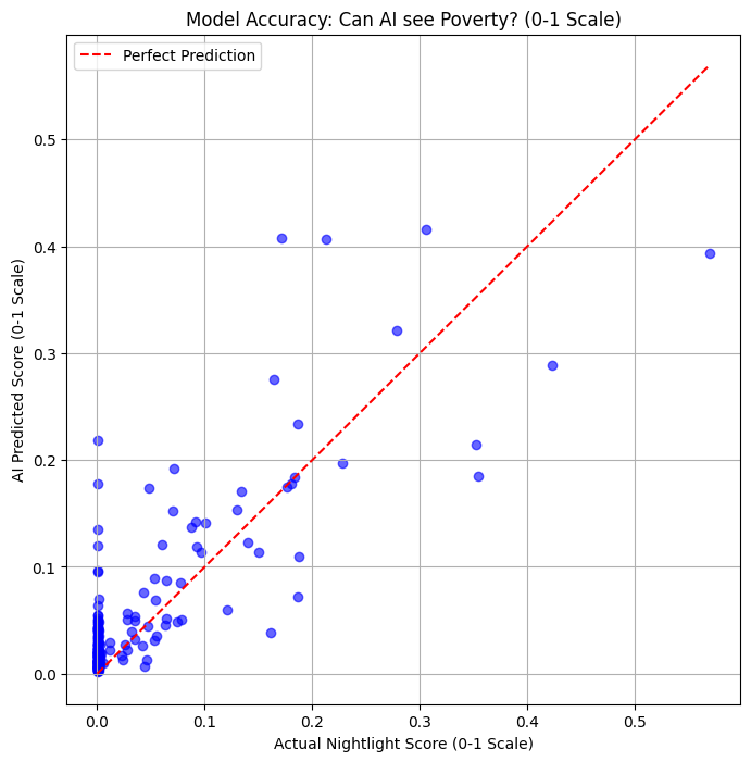 Scatter plot showing the model’s performance on the test set.
Interpreting the Map
The final output is a heatmap of Morocco, visualizing the predicted economic activity.
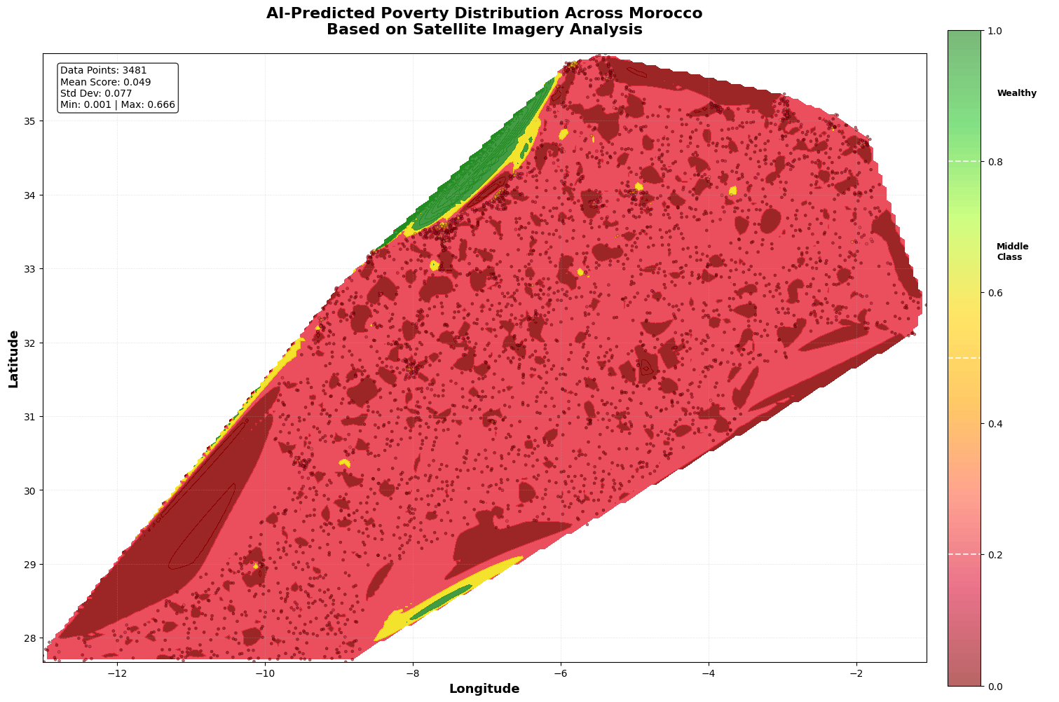
What did the model find?
The model successfully identified key economic hubs versus marginalized areas.
Top Wealthiest Areas Identified:
- Rabat/Salé (Lat: 34.026, Lon: -6.811) - Score: ~0.67
- Tangier (Lat: 35.773, Lon: -5.778) - Score: ~0.60
- Casablanca Region (Lat: 33.599, Lon: -7.620) - Score: ~0.56
Poorest Hotspots Identified: Many of the lowest-scoring points (Score ~0.001) were located in rural coordinates (e.g., Lat 29.894, Lon -9.556), often corresponding to remote or mountainous regions.
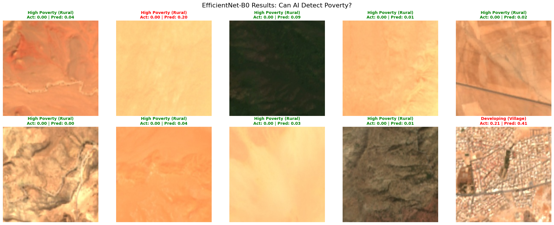
Here is a visual example of a specific prediction:
⚠️ The “Desert Issue” & Bias
No AI model is perfect, and this one revealed a specific Geographic Bias, which I call the “Desert Issue.”
Morocco has vast expanses of uninhabited or sparsely inhabited desert and arid land.
- The Problem: The model sometimes struggles to differentiate between “undeveloped barren land” (naturally empty) and “impoverished settlements” (lack of infrastructure).
- The Result: This can lead to skewed “High Poverty” statistics in unpopulated desert areas, inflating the poverty numbers (like the 94.5% figure seen above).
⚠️ Night Light Data Bias
A critical learning from this POC was the limitation of using Nighttime Lights (NTL) as a proxy for economic activity in Morocco.
Observation: Most of the satellite imagery for Morocco at night is extremely dark.
Unlike highly urbanized nations where night lights correlate strongly with GDP, vast areas of Morocco lack street lighting even in populated rural zones. This “darkness bias” forces the model to struggle with feature extraction, as it sees little to no signal in many training patches.
Limitations & Future Improvements
This Proof of Concept successfully demonstrated that deep learning can map economic activity, but to move from a POC to a production-grade tool, we need to address these biases.
Proposed Strategy for Improvement: Instead of training solely on Moroccan data (which suffers from the “darkness” issue), a better approach would be Transfer Learning:
- Train the model on data from a country with high-quality, varied ground truth and night light data.
- Fine-tune or directly apply this pre-trained model to Morocco.
This would allow the model to learn robust features (roads, density, structures) from a rich dataset and then “transfer” that understanding to the Moroccan context, bypassing the limitations of the local training data.
Conclusion
This project demonstrates that deep learning can be a powerful tool for economic monitoring. Achieving an MAE of 0.03 is a strong indicator that satellite features correlates strongly with economic markers. However, applying these models requires careful attention to geographic context to avoid misinterpreting empty land as poverty.
Go Check This Out
If you want to dive deeper into the science of poverty mapping from space, check out these papers: